If you want to represent all kinds of statistical data in a graph, nothing better than making a Pareto chart in Excel. Also, it is perfect for assigning an order of priorities to the problems that may be afflicting organizations, businesses or industries. If you still do not have it installed, you can download Excel from its official website.
Likewise, the Pareto diagram can be easily applied to all areas of study and that is why it will be very interesting for you to get to know it in depth. If you really want to learn how to represent statistical data like a professional in Excel, so that you can apply it to any subject, keep reading this article.
How do you make a Pareto chart in Excel?
It is important that you know that a Pareto chart is a graph that represents different problems of an organization by means of bars and a line. Where, the bars represent the frequency with which these problems occur and the line would represent the percentage of each problem that the organization faces.
We are going to represent this diagram by means of a simple graph, which will be very useful for prioritizing the most common failures of an organization. Next, you will learn the steps to incorporate relevant information into an Excel graph with the Pareto principle.
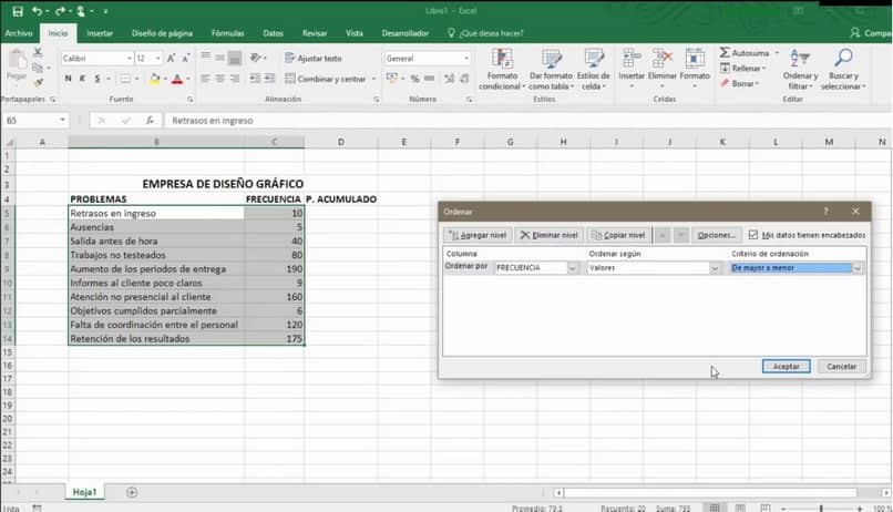
Organize the data
Once inside Excel, you are going to place the information you have about the problems that frequent the organization without caring about the order. In the first column you will place the problems, in the second column you will place the frequency and in the third column you will place the accumulated percentage. Although if you do not know how to add it, you can learn to put or create columns in Word
Next, you are going to select all the aforementioned problems, to organize them in order from most to least frequent. Then, you are going to go to the Excel taskbar and click on “Sort and filter” and select “Frequency”.
Also, you are going to open the “Order criteria” tab and you are going to choose from “Highest to lowest”, in this way you will have your data sorted.
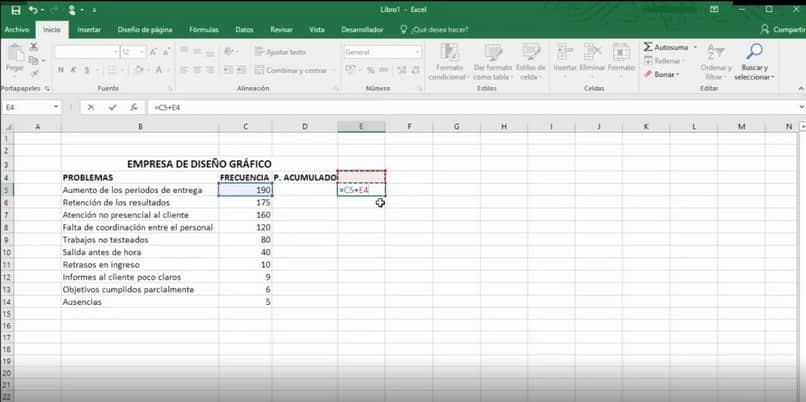
Calculate cumulative percentage
To get the percentage in Excel that is equivalent to each problem, you must first add all the frequency data. You can achieve this by going to an empty column that is parallel to the previous ones and you will put “= cell number of the frequency of the first problem + the previous cell number”
Next, you will have the result of the sum in that cell, select it and auto-fill all subsequent cells. This way you will obtain the total sum of the frequency and the particular sum of each problem that the organization faces.
Next, you select the first cell in the cumulative percentage column and divide the frequency number for each problem by the cumulative total. You will do this by placing “= cell number of the sum of the frequency of the problem between the total of the sum of the frequency of the problem”
Subsequently, you do the auto fill of all the lower cells and Excel will take the values of each cell of the accumulated percentage. Finally, you select the percentage button on the Excel task bar and it will give you the percentage value of each problem.
Preparation of the diagram
Once you have all this data, you go to the task bar, select “Insert”, then choose “Recommended graphics” and then “Grouped column”. Then, you give the accept button and the diagram will appear in Excel to place the data.
For you to place the values of the numerical axis you are going to select it and you are going to right click on it. Then a window will open and you will select “Format the axis”, then another window will appear where you can place the frequency values.
The next element to modify in the diagram will be the percentage values and we do the same steps as above to modify their values. Once inside the axis format, you will place the value “0” in the “minimum” row and the value “1” in the maximum row, which is equivalent to 100%.
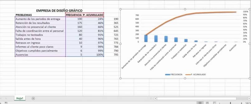
In this way, your Pareto diagram will be ready where all the problems of your organization will be represented in percentage form and their frequency. If you managed to make a Pareto chart in Excel through this complete guide, follow this wonderful post.


