The new version of Home Assistant for the month of March has just been released, right now you could install it because you will have received the corresponding notification in this home automation system. The Home Assistant 2024.3 version brings important new features to the graphical user interface, we can say that it is a revolution more than an evolution, because now we experimentally have the possibility of creating a section view, and organizing it in our main panel in a much more organized way. easier, friendlier and understandable than before. Do you want to know all the improvements and new features they have incorporated?
This home automation system is more alive than ever, and a good example of this is that, monthly, we have updates to many functionalities, improvements to the features that are already present, and above all, they listen to the user community to continue implementing improvements. or ideas that we are indicating to you. This March update brings a function desired by many of us, and that is that we can now customize and organize the panels in detail, and all this in an intuitive way.
Main developments in 2024.3
This new version comes more loaded with new features than what we are used to in Home Assistant, and that is great news, because it means that very important changes are coming to light to improve our home automation system.
New completely redesigned dashboard
The development team has worked hard on customizing and organizing the Home Assistant panels, not only to make it look much better, but to make it more intuitive than now. Additionally, creating a default dashboard has also been improved to be more useful, easy to use, and relevant out of the box. This dashboard improvement project has been so important that they have internally called it “Project Grace”, and basically what it consists of is making a series of improvements to Lovelace (the graphical user interface). The objective of this Grace project is to preserve the best of Lovelace, such as flexibility and extensibility, and mitigate problems such as the complexity at first of leaving everything well configured, as well as its lack of scalability and poor ability to be responsive in the different devices from which we enter the home automation system.
So far, we have a total of three different views for Lovelace:
- Panel: An entire card covers the entire entire view.
- Side panel: we can create up to two columns of cards.
- Masonry: it is the most complete of all, and allows us to create a large number of cards in different columns. This is the default when we create a new panel.
The “Masonry” panel is perfect for creating a compact control panel and saving screen space. The problem is that it presents the cards in the PC view or on a tablet, which is not well understood, it is not clear at all, especially for new users who are adding new cards and want to organize them. At first, it can be really frustrating to create a well-organized panel with what we need, since it would work like this:
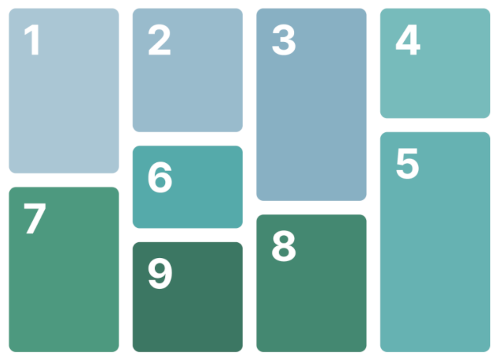
As you can see, the logic of the design depends on the height of each card that we are going to incorporate. A height difference of just 1 pixel means that, instead of being placed on the left, it will appear on the complete right, that is, a real chaos for the user who wants to correctly organize their panel to interact with it. Furthermore, depending on the resolution of the screen from which we enter Home Assistant, the cards will be shown to us in a different way, always with the aim of optimally filling the heights.
Now in Home Assistant we can group the cards by sections, and within each section we can put the cards we want, to quickly locate the buttons or information we need, regardless of where we are consulting this. When popping a card into a section on a grid card, the relative position of the cards may change depending on the screen size, but they will always be in the same “zone”, making it a faster and more streamlined user experience.
Now we will have a new experimental section called “Sections” when we go to create a new panel in Lovelace, as you can see:
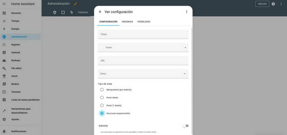
Once created, we have the possibility of naming the different sections and putting the cards we want inside, always everything well organized. By default a new section will be created, if we want to add more sections we will have to click on the corresponding button. Within each section, we can put various buttons or information that we want. For example, the view we previously had with “Masonry” of our main panel was:
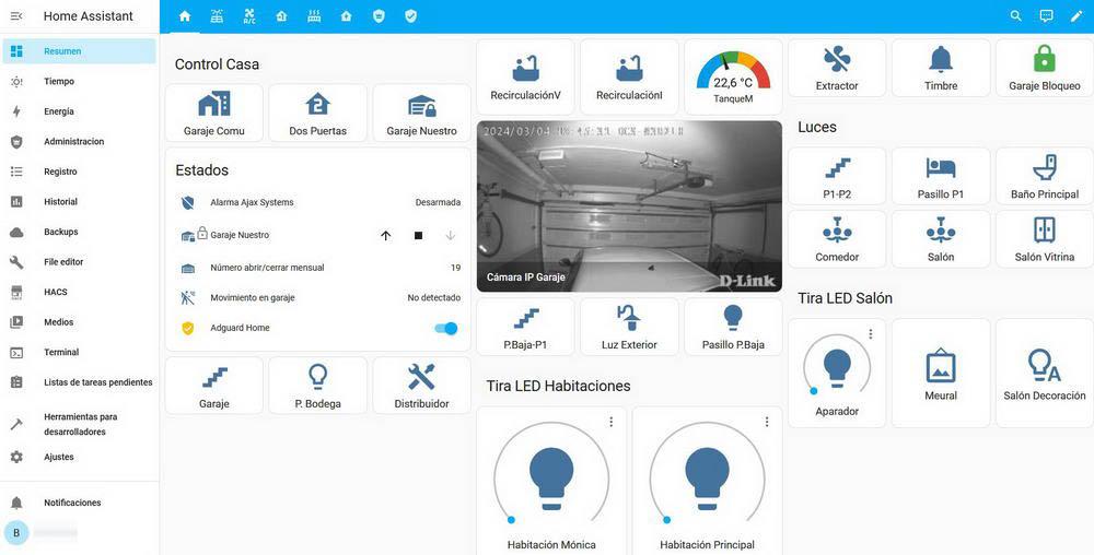
And now we have the following view, much more organized and clean:
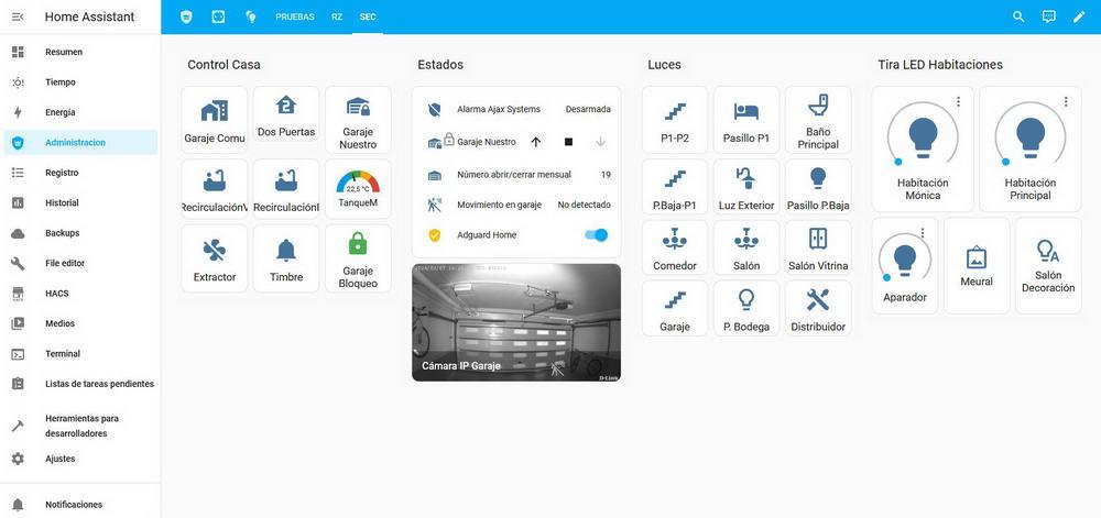
From smartphones with a vertical screen, the application does not currently support this “Sections” function, we get the source code directly, so we will have to update the application to be able to view it correctly.
The way to add any card will be done as always, in fact, we can add them by card or by entity, and the same if we get into the sensors or actions of an integration, we can directly add them to this new “Section” of Home Assistant. One of the main benefits of this new “Section” is that it will be much easier to build a dashboard and have it work well on multiple screen sizes. The view will rearrange the sections horizontally depending on the resolution, and within each section we will have the same thing for easy location. The Home Assistant team is currently working on standardizing the pixel size of the tile, button and sensor cards. These cards will occupy a specific size, and the rest of the cards will occupy the full width of a section by default.
Drag and drop ready for sections
Related to the previous feature, now that we have sections and a grid system, we have the ability to do “drag and drop” intuitively. If we want to change the order of the cards, just drag them where we want and they will be ordered in a completely intuitive and predictable way. The organization form they have chosen is Z-grid, due to its simplicity, predictability and ease of memorization, which is why it is the default.
We will be able to drag and drop both the sections to reorder them among themselves, as well as take a card within one section and move it to another, in this way, we will have the maximum possible versatility. A very important aspect is that right now all these functions are in the experimental phase, so the Home Assistant team will continue improving this functionality and changing many things, so we do not recommend using it in production because in a few months they could change many things.
Other changes implemented
This March 2024 update has not only incorporated changes to Lovelace, we also have other improvements and changes:
- Now we can run scripts with the possibility of entering data by the user. This way, we can send data ourselves and if that script captures that data, it will execute the corresponding action. What this allows us to do is unlock a whole world of automations.
- In the “Energy” panel we will have a new graph that will allow us to monitor the energy consumption of different devices over time.
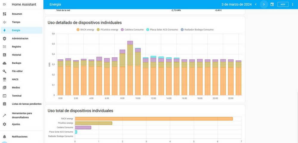
- Improvements in “Assist” to execute different orders.
- Improvements when translating entity states within the templates, we will no longer receive information such as “on” or “off”, but rather it will indicate whether or not movement has been detected (in case it is an automation to detect movement) . This will be done in the Home Assistant language that we have configured.
Of course, new integrations have also been added natively, and there are changes that make certain integrations that we had until now incompatible. Finally, the loading speed of the Home Assistant CORE system has been improved, it is now capable of starting in half the time, a really important improvement to have everything available as soon as possible.


