Microsoft has a bad habit of hiding Windows features, changes or functions. On this occasion it has been discovered that there is an important modification to the operating system that has not been announced and that is disabled. With it, one of the fundamental elements of the user experience changes significantly.
Changes in the Windows interface have always been the order of the day. For many users, the fact that each version of the platform modifies elements that were already apparently fine ends up being a bit chaotic. But, on some occasions, these changes are seen to help the appearance of the operating system to improve solidly. In the case of the latest that has been discovered, the change has occurred in the All applications menu found in the Start section of Windows 11.
Improving a criticized design
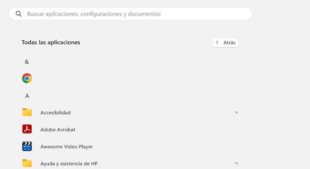
Microsoft probably knows well that users don’t like the way the All Apps menu looks today. What Windows 11 does right now is show you a list of apps in alphabetical order by blocks for each of the initial letters. It is a design so lifeless and so prehistoric, that it is surprising that it is what we have these days in the current version of the operating system.

Mainly, one of the current problems is that it is a very inefficient design. A lot of space is wasted in all directions and, if we want to go to an advanced font application, we have to scroll to infinity or click on the arrow pointing down. It is not a practical system and this means that we never use this menu. Luckily, it is already changing.
It’s hidden
For now, where this menu has been seen is in the latest Beta version of Windows 11 that has been published under the code KB5035953. As several professionals explain, it is interesting and curious that Microsoft has incorporated this change in the beta, but has not distributed it to the Canary or Dev versions that usually enjoy the latest modifications and news. Furthermore, it is not overlooked that nowhere has it been officially mentioned that this new feature is available in the beta in question. It gives the impression that it is being tested privately or that they have no interest, at least for now, in promoting it.
As you can see in the following X post, it is true that, with this new design, the problem of space and the poor arrangement of application icons as currently seen is eliminated. However, Microsoft should perhaps consider implementing some design resources to help create a clearer layout. Six applications appear in each line of icons and at no time is there a division by letters, by categories or by any other element. This means that, although better than the previous one, it is still a design that lacks a lot of spark.
Windows Latest
@WindowsLatest
Microsoft is exploring a new design for Start menu’s All Apps in Windows 11. This may or may not ship in production.
Here’s a quick comparison between the old and new. Which layout do you prefer? #Windows11 https://t.co/IurJJh8fTB https://t.co/30W4i2AqRm
April 1, 2024 • 20:32
275
5
Luckily, what we do see is the name of each app below the icon, since without it there would be absolute chaos. Still, we’re keeping our fingers crossed that the lack of an official mention means that Microsoft is just testing it out and may have another, better-designed version on its hands.
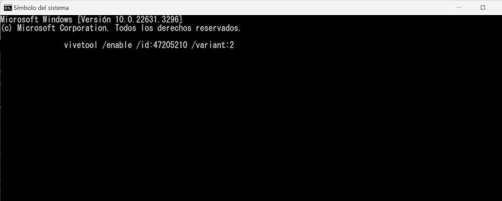
If you are using the Windows 11 beta, take note of what you have to do to activate this change to the All Apps menu design. First install the latest update and then download ViVeTool. Extract all contents of the file, go to Start and search for CMD to open Command Prompt. But you have to make sure you open it as administrator.
Then enter the directory that corresponds to ViVeTool and execute the following command without the quotes: “vivetool /enable /id:47205210 /variant:2”. Restart your computer and check if the design has already been updated. In case it hasn’t worked for you, BetaNews recommends that you use this alternative command: “vivetool /enable /id:48433541,48433706,48433719,48468527,48468541”. If you regret it, you will have to use the same command again, but changing “enable” to “disable”, since that will manage your disconnection.

As an appetizer to a more definitive version of the All Applications menu (if we see another one before Windows 12), this new interpretation is not bad at all. But Microsoft should think about the shortcomings it has in terms of giving its menus and interface a really attractive appearance, since with Windows 11 they are not managing to connect with users.


