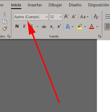
The powerful text editor that is part of the office suite of the software giant Microsoft, we are talking about Word, is one of the most used programs globally. Hence, the changes that the company introduces here affect a huge number of people, as is the case.
As a general rule, we are used to working with a certain aspect and through a series of functions in the aforementioned editor. Possibly many of you have already been accustomed for years to a certain routine or to a mode of operation of the program as such. Hence, certain changes that occur suddenly may disconcert many. This is precisely what has just happened, or will happen to you shortly.
Specifically, we are referring to a change that directly affects the font, typography, or commonly known as the default font in Word. Perhaps at first many of you did not pay attention, but for years this default font in the text editor was Calibri. However now Microsoft has decided to make an important change here. And an update in Microsoft 365 is providing users with an important modification in this regard.
We tell you this because from now on Aptos will be the font that will be used by default in the popular Microsoft program. Some of you may have already experienced this change that is made automatically, or otherwise it will reach you in a few days.
Why Word will use Aptos as a font
It must be taken into account that the font called Calibri has been the default in Word for 15 years. However, times have changed a lot and now the firm is looking for a font with a clearer appearance that makes it easier for its users to read texts. That is precisely where the aforementioned Aptos comes into play, which the firm has chosen to be the default font in Word.

Other reasons that are part of the decision made in this regard is that Aptos guarantees a better display of text content on different screen resolutions. This also affects the font sizes that we configure in the program. All this in order to offer its millions of customers a cleaner and clearer experience when creating and reading this content.
In fact, and largely due to the clean strokes of this typeface, the software giant considers that it is a typeface more suitable for the digital world in which we are immersed. In short, if you have suddenly noticed this change in your text editor and you don’t know the reason, it is important to know that it comes from Microsoft.
Obviously, as happens in most of the programs that we use on our PC, we can change and personalize these interface parameters. We are talking about the font that the text editor itself offers us by default, but we can always change these sections and use another that is more comfortable for us.


