MásMóvil is updated to MasMovil. The yellow operator of the MasMovil Group follows the example of the main brand, MasOrange. For this reason, the telecom seems to have wanted to change its image and renew its logo, following a style line much more similar to the one that the central axis of the telephone company has right now.
It is not the first time that the operator decides to carry out a restyling of its logo. The last one was in 2011, following its essence of including yellow in its letters, in addition to including accents in the vowels a and o. However, to continue with the new essence of the company after its merger with Orange, the telecom renews its logo and begins to use a monochrome version.
Without accents and everything in black
The merger between MasMovil and Orange has brought, in addition to a change in the organization of the different brands, a new design for the yellow telecom logo. Although the main color of this brand is yellow, the truth is that with the new logo they forget about this tone and opt for a monochromatic design in black.
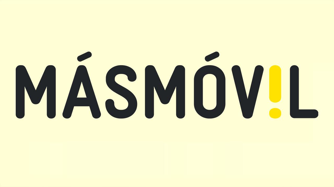
And the color is not the only change, you can also see the use of another font (as you can see in the following image). There is no doubt that MasOrange wants its different brands to share the same image identity. Hence, the image of this operator has been renewed. Just as it also says goodbye to the two accents in the vowels a and o. And it also loses the exclamation painted yellow that replaced the vowel i in the name of the yellow operator.
![]()
In this way, the operator individually follows the MasOrange style line. And although in some parts of its website you can still read “MásMóvil”, it is clear that the yellow operator is renewing this logo to forget about the previous name with the two accents.
Another renewal of MasMovil
This operator, which is one of MasOrange’s main brands, is not the first time it has renewed its style. It must be taken into account that this operator was presented back in 2006. At that time, it was launched into the telecom market with an icon of a hand performing the call symbol. In addition, it was also decided to include only an accent on the first vowel (a) of its name and to include the ‘.es’ at the end of it. As for the initial color, it was decided to combine black and white, giving priority to the latter for both the name and the hand icon.
In 2008, the operator experienced its first restyling. The typography was modified, the name was put in black and the hand icon was also renewed, moving it away from the ‘More’. However, the essence of the operator’s initial logo was continued. The real change came in 2011 when the operator surprised by completely renewing its logo.
In that year, the logo that we knew until now of the operator was presented. The two accents were included in the vowels ayo, in addition to opting for the exclamation in another key to replace the i. And the symbol of the hand making the call gesture disappeared completely. And, of course, he switched to a single-line composition. Therefore, the evolution of this logo is clear, until reaching a monochromatic black version.


