Excel offers us valuable elements that go far beyond a simple spreadsheet, one of them is inserting graphs with different functions. In this post you will learn how to make a graph in excel taking data from several sheets, in a simple way.
Excel is a program that is part of the famous Microsoft Office package, it is basically a spreadsheet, similar to the ones used by accountants before the first computers. As in those days, the Excel spreadsheet can contain accounting data for companies and individuals.
A chart in Excel is a tool that allows us to easily display the values coming from a group of cells. In this way, all the information that you want to present in a report, statistics, trend, or data analysis can be explained in a visual way.
What are the types of charts in Excel?
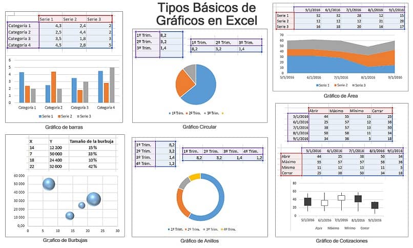
The list of graphs available in Excel is extensive, some types of graphs have subtypes, in addition there are graphs that are only present from a certain version of Office; The main ones that we can mention from this list are the following.
For all versions of Office, it incorporates the same tools for creating graphs and changing or modifying their size (column, line, circular, ring, bar type, area, with XY or dispersion function, bubbles, for quotes, surface and radial). Office 2013 includes combined graph (columns with lines).
Office version 2016 onwards, they added graphs (rectangles, solar projection, with histogram, boxes and whiskers, waterfall and funnel). And Map Chart.
If you want to know more details about the types of charts that Office has, you can just open excel and look in the insert tab, then right in the middle, you find the list of Chart tools. Let’s move on to the creation of a graph in excel taking the data from several sheets.
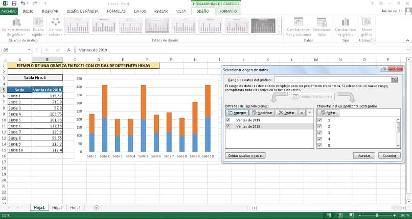
How to make a chart in Excel taking data from multiple sheets?
- The first step is to previously have the data that will be used for it. This action of linking one or more cells to a graph is called consolidating, so that the graph can automatically change its information.
- With this in mind, we will use several sales tables of a company with multiple locations. These will have a column with the title Venue and another called Sales, the first will contain the name of the venue and the second the amount of annual sales (one for each year), and they will be located on different sheets.
- We select the base cells for the graph (the oldest year), we press the “Insert” option.
- We press the button of the type of graph desired, such as “Column in 2D”.
- The graph is immediately inserted in the center of the screen, which we can drag to the desired position.
- We click on the graph, we go to the option “Design > Select data > Add”.
- In the “Modify series” window, we delete the content of the “Series values” field.
- We press on the button next to it and on the other sheet we select the cells, we will only take the numerical ones (we ignore the titles and the venues).
- We delete the text of the field “Name of the series”, of the “Modify series” window.
- Click on the cell selection button next to it.
- We select the title cell of the sales column.
- Atime we click on “OK” to return to the “Select Data Source” window.
Charts are easy to read, which is why they are a very useful resource in Excel. There is a wide variety (more than 18 different types) that we can insert into a spreadsheet. Learning to do them is undoubtedly very beneficial for our work and daily life.


