With this change of look, WhatsApp seeks to continue strengthening its privileged position as the first messaging option while renewing itself based on three principles: freshness, closeness and simplicity.
Group messaging app Meta has announced a major facelift for its mobile app. With this update, Mark Zuckerberg’s company seeks to refresh the aesthetics of the app while maintaining the operation to which we are accustomed and making it easier to use. Some of the new features are an interface and icons that “help you find what you’re looking for faster” and “new illustrations with animations added to increase the fun.”
WhatsApp thus emphasizes the green color that forms its hallmark, wrapping the application with a tone that abandons the blue that was previously used in various information displayed. With the change, the Android app becomes more similar to the iOS app on iPhone. However, the main background remains light in color, and the greens are reintroduced in different shades, so users will not gorge themselves on bright green either.
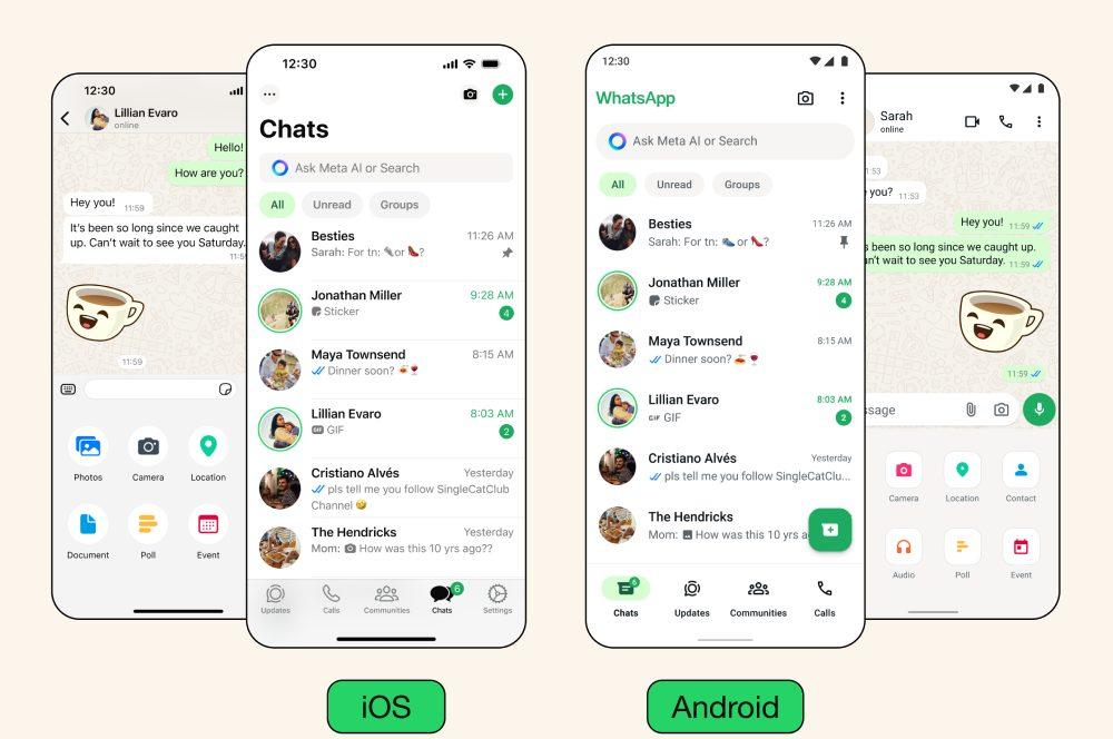
In addition, Meta replaces the chat search bar at the top with a bar featuring its artificial intelligence assistant. As can be seen in the video of the English version of the app that they have shared through X, the new message that appears in said bar is “Ask the Meta AI or search.”
Having said all this, one of the changes that its users will probably like the most is the one that concerns dark mode. Many people prefer to use dark mode in different applications, both to reduce eye strain and to save battery life on the device. Although previously this function in WhatsApp gave the app a dark green background that was not black, with this update, the dark mode becomes even darker, so that the color becomes blacker and the contrast increases, managing to “reduce visual fatigue in low-light environments,” they indicate from the app.
we’re rolling out design updates to give WhatsApp a fresh new look, while keeping it familiar + easy to use 🤩 here are some ways it’s changing ⬇️
• updated layout and icons that help you find what you need faster
• new illustrations with added animation to… https://t.co/fiamWZpRz5 https://t.co/pFu0cfxpWY
May 10, 2024 • 11:02
1.6K
52
According to WhatsApp Design Director Idit Yaniv, Meta seeks to “create an app that not only works seamlessly, but also feels like a natural extension of your phone, allowing you to focus on the conversations that matter in your life.” daily. “We believe success is achieved when our design improves the way people communicate on WhatsApp and allows them to connect in new ways.”
Thus, for the designers it was important to renew the app without causing sudden changes that would make people have to learn how to use it again: “When designing, we consider different levels of connectivity and digital literacy to keep WhatsApp accessible, and we are careful with changes that affect people’s muscle memory,” Yaniv explained in a post.
A simplified design
The new look that the application receives is in line with the latest trends in mobile and web design, seeking simplicity and facilitating the most intuitive use possible. It will not be free of detractors, of course, and some users are already asking Meta to rescue the blue color that previously appeared, for example, as the background behind the number of new messages to be read in a chat. Not only lovers of blue, but also skeptics of AI assistants will dislike the introduction of this feature.
In summary, the parts that the new WhatsApp has modified or introduced are: the top bar in iOS, the bottom bar in Android, the chat filters, the icons, colors and illustrations and the attached content tray.
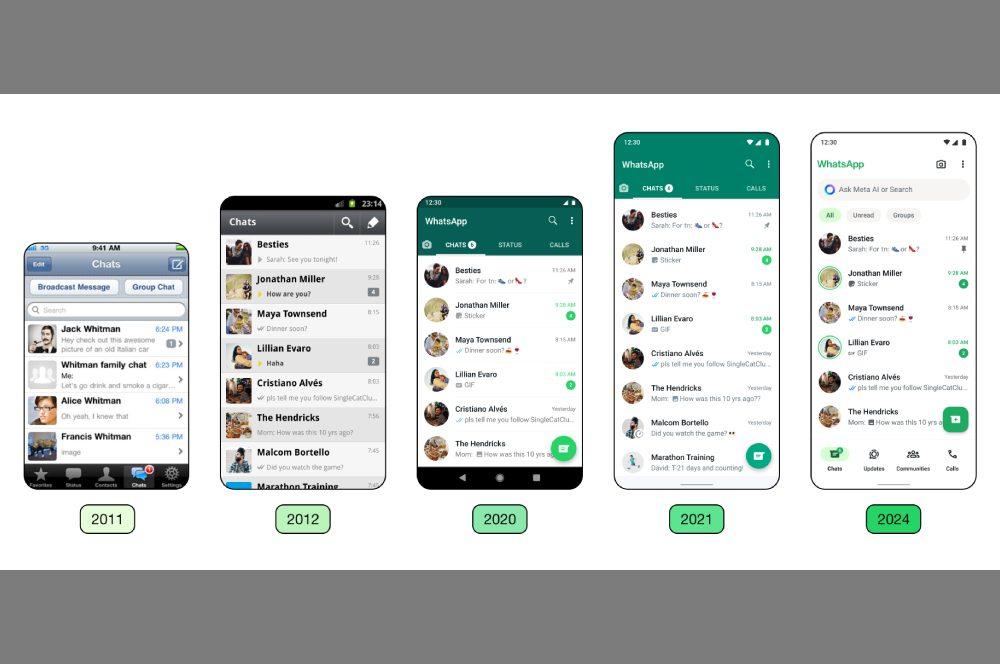
This redesign joins other new features that the application has been introducing in recent months. For example, also this May the application introduced the new functions of events and responses in notification groups, trying to boost the shared WhatsApp experience through communities.
“Thanks to events, it is now easier to plan meetings directly on WhatsApp, whether it is a virtual meeting or a dinner to celebrate a birthday,” says the Blog of the company, adding that they also include “responses to message groups so that administrators can communicate with members and, at the same time, ensure that these groups remain an easy space to catch up with what is happening in the community”.


