tvOS 14 review
In our tvOS 13 review from last year, we were quite pleased with the changes Apple has made to the Apple TV. The multi-user support is something many Apple TV owners have been waiting for. This year the improvements are a lot smaller, but nevertheless worth taking a closer look. We therefore discuss our most important initial findings in this tvOS 14 review.
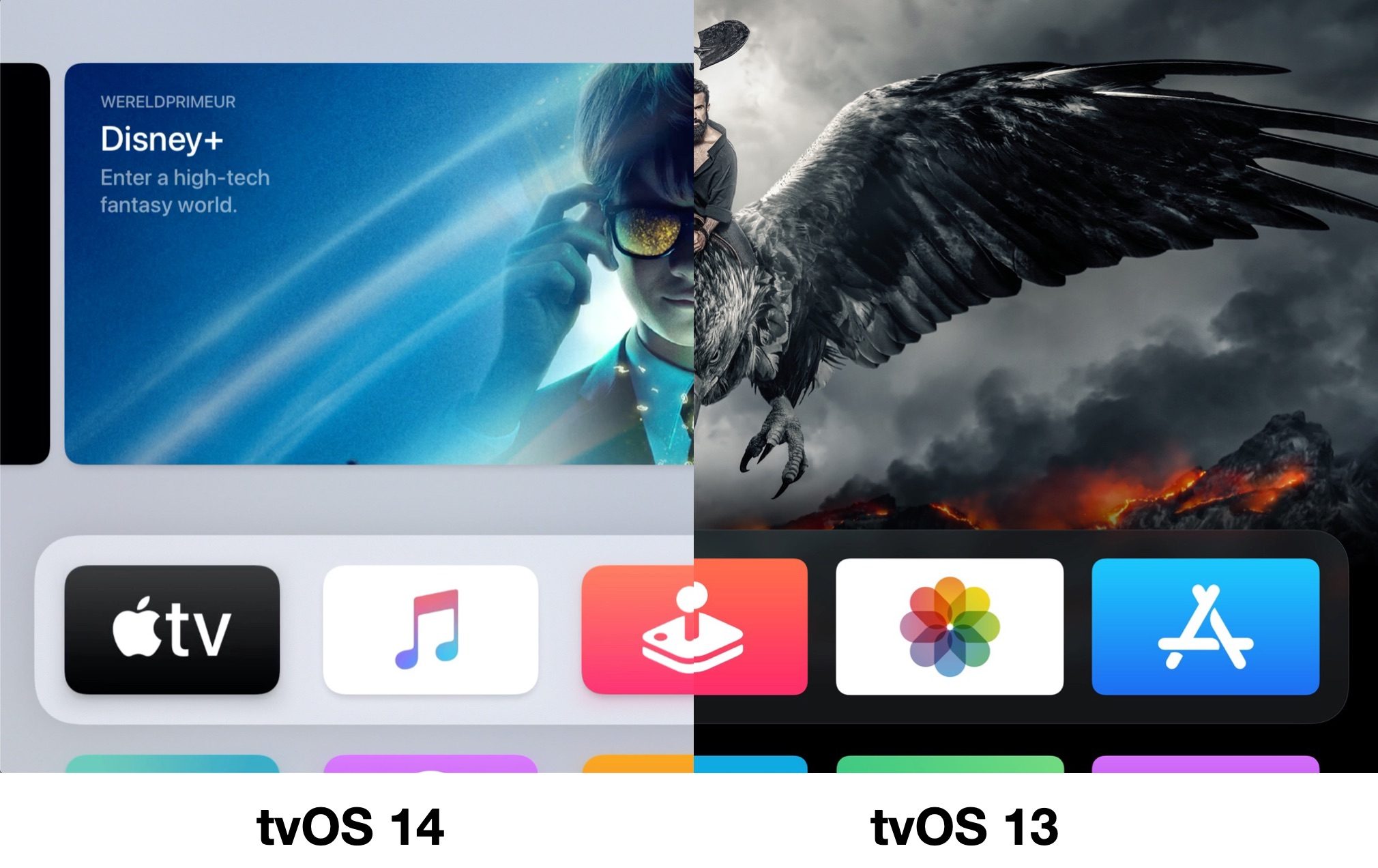
tvOS 13 brought a major redesign to the Apple TV. All app icons were a lot rounder and the overall design looked a bit more ‘friendly’ than in tvOS 12 and older. In tvOS 14, Apple goes one step further. For example, the app icons have been given a new shape, making them even rounder and more stretched on the screen. It once again gives tvOS 14 a somewhat friendlier appearance, without you immediately noticing that much has changed. The same redesign is reflected in the Control Panel. Where in tvOS 13 it took up the entire right side, in tvOS 14 it is more of a rounded panel that appears on the screen from the right.
tvOS 14: Control Center and HomeKit
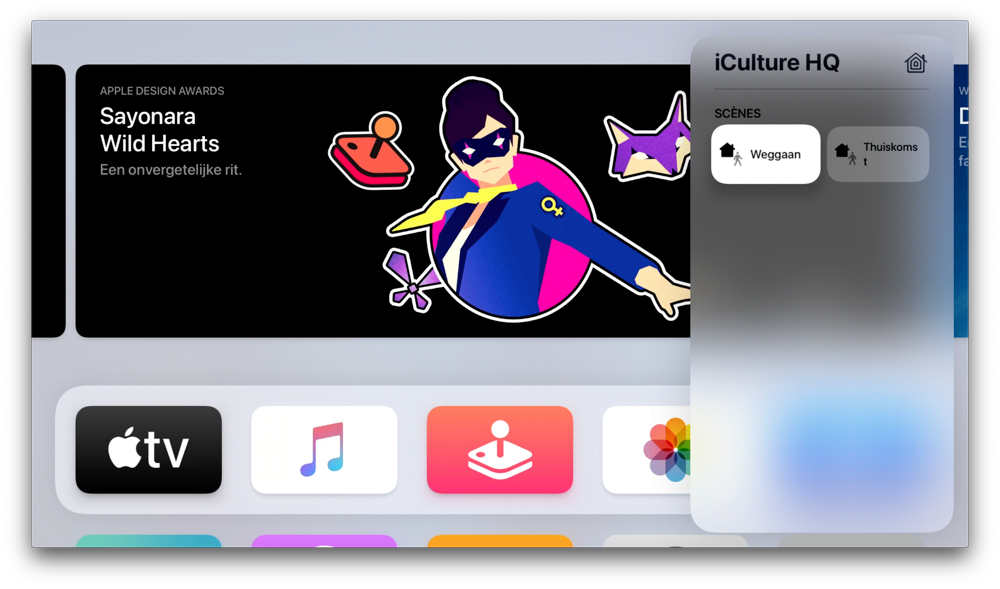
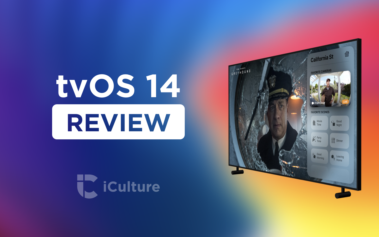
And speaking of the Control Panel: Apple has hidden some new functions there. You use the Control Center to switch between users and go to the currently playing song. Apple has now added a new HomeKit button. At the bottom left you will now find a kind of widget as you already find on your iPhone. You can now finally quickly control your HomeKit devices from your Apple TV. Unfortunately, this is currently limited to switching scenes on and off and viewing video from a HomeKit camera. We regret that you don’t have the option to control individual accessories, but on the other hand we wonder how often we would use that.
In recent weeks, we have actually hardly used this function. It takes quite a few steps to activate a scene with the remote control. First of all, you have to hold down the home button and then swipe down twice and left once. With Siri on the Apple TV, this is a lot faster. For Belgian users (where Siri still does not work on the Apple TV), it might be a little more useful.
For HomeKit cameras, we like the new options a bit more. From now on you can view the status of your camera images directly in the control panel. This also appears automatically when using a doorbell with a camera as soon as someone presses the bell. If you are watching TV, you can immediately see who is at your door from the sofa in the top right corner. You can also request the camera images with Siri and play them back via Picture-in-picture.
We ourselves use the Eve Cam in combination with HomeKit Secure Video. The camera is set to detect activity as soon as we are home, so viewing the stream is not possible. In that case, you cannot view the camera images on the Apple TV either. It therefore only makes sense if your camera also streams when you are at home. The function comes into its own most with HomeKit doorbells, but they can actually only be counted on one hand.
Still, we would have liked to see a separate Home app on the Apple TV. We think Apple could have gotten more out of that. An app that does this well is DayView, in which you can also view calendar appointments and display more useful information. It is not entirely coincidental that the developer has been working at Apple for a year now. We therefore hope that Apple will expand the possibilities even further.
Improved screen savers
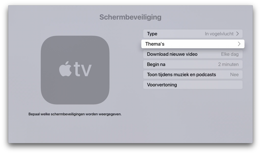
Another notable improvement can be found with the screensavers. We love these beautiful images of cities and nature reserves. It’s nice when a new screensaver suddenly pops up that you haven’t seen before. Still, it can sometimes be a bit annoying that that one stupid screensaver keeps appearing. That’s why you can now disable certain themes in tvOS 14. If you don’t like the underwater images, you can turn this off via the tvOS settings. Still, we think it’s a pity that you don’t get more control over the exact screensavers. They are still downloaded in the background, without you having any influence on which screensavers appear exactly. You now have control over the themes, but we would have preferred Apple to go a step further. And speaking of these screensavers: no new screensavers have been added and we are actually a bit disappointed in that.
Finally, the new picture-in-picture mode is worth mentioning. Previously this only worked in the Apple TV app, but now it works with other apps as well. It’s a handy addition, but you don’t use it every day. It mainly makes sense for HomeKit cameras, because we rarely want to use another app on the Apple TV while we are therefore watching YouTube or Netflix. It can come in handy if you use a workout app on your Apple TV and want to watch some Apple Music video clips at the same time.
Not yet tested
There are some features we haven’t been able to test yet. The most important of these is the support of YouTube in 4K. This improvement is not yet available in the current version of the YouTube app. YouTube has promised that this will be coming soon, but we find it striking that this should take so long, even now that tvOS 14 is already available.
Other noteworthy innovations that we haven’t been able to try ourselves are the support for multiple controllers and switching between saved game profiles with multiple users. But both innovations offer gamers in any case a pleasant improvement. It is actually strange that support for separate progress data for each profile was not available before. This is a welcome addition, especially in combination with Apple Arcade, although we must admit that we rarely play games on the Apple TV.
Cons in tvOS 14
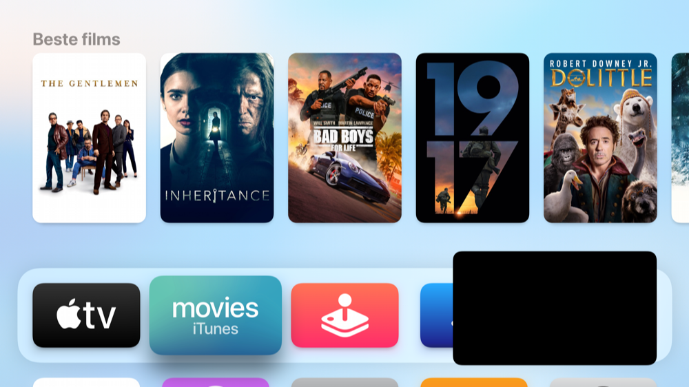
There are still a number of points in which we are somewhat disappointed. For example, for the Music app you cannot choose that recently played music is displayed at the top of the tvOS menu. That was the case before tvOS 13, but since last year you will find full screen previews here. Although we are a fan of this, we think that Apple updates this far too little to make it really functional. For example, we’ve been looking at an almost complete blue screen with Billie Eilish for months, which makes it kind of lose its point. Since a few months you can choose to show your own viewing list with the TV app, which makes it strange that this is not possible with the Music app.
We also regret that Apple still hasn’t released Siri for Belgian users. It seems like Apple doesn’t care. Fortunately, there is a trick to get Siri working on the Apple TV in Belgium, but we would have preferred Apple to roll this out officially. Unfortunately, another drawback from our review from last year hasn’t been brushed aside: the Photos app still only shows the power user’s photo library.
score
7
tvOS 14
Free
Advantages
+
- Some nice improvements, like viewing HomeKit cameras
- Picture-in-picture can be useful
- Slightly nicer design for home screen
Cons
–
- No improvements for Music and Photos app
- Activating HomeKit scenes via Control Panel inconvenient
Conclusion tvOS 14 review
tvOS 14 is a nice update with some nice improvements. The slightly refreshed design is pleasant to look at and makes tvOS 14 just a little more modern. The improved support for HomeKit is nice, but the way Apple has implemented this is actually a bit clumsy. It’s only really useful if you have a HomeKit camera at home. Other improvements have yet to prove themselves, such as picture-in-picture. With all the other new tvOS 14 features, there is at least something to look forward to, because for now we still have to wait for support for YouTube in 4K.
tvOS 14 is now available for Apple TV HD and later. Check out our overview of tvOS 14.

